I love the theme 'Weird and Wonderful' because I can explore almost all aspects of photography. For this topic I want to do mythical/fairytale. This is because I really enjoy portrait photography and this allows me to be creative with the environment, costumes and makeup. I plan to picture fairies and develop the images on photoshop, I want the fairy to appear enchanted and graceful so I will like to attempt levitation photography, to do this I will look up tutorials on youtube and use it in my work. When planning the costumes I want to use the colours white as that is the signature colour for a fairy and green to show how they relate to nature. After the fairies I am planning to start the project on elves because they are my favourite mythical creatures and love how they are so involved in nature. When shooting, I will make sure to take the images in the park and plan my locations, I will make sure to take them near trees and in photoshop, exaggerate the neutral colours like pale greens and yellows.
When shooting I will need a tripod for levitation and a stool. I will shoot on my DSLR in Manual mode to demonstrate my understanding of the camera. When editing I will use techniques and ideas from photographers I had researched. Overall I believe I will do well in this project because it is something I believe I will enjoy and I find very interesting.
When shooting I will need a tripod for levitation and a stool. I will shoot on my DSLR in Manual mode to demonstrate my understanding of the camera. When editing I will use techniques and ideas from photographers I had researched. Overall I believe I will do well in this project because it is something I believe I will enjoy and I find very interesting.
Rene Magritte
|
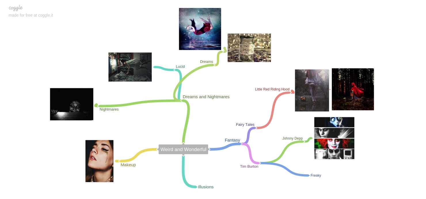
Rene Magritte is a surrealist artist. His paintings are known to be very dream like and weird. By putting objects in front of a man's face, it throws the viewer off balance. The artist has used soft colours in his painting, I like how he has blended three layers softly in the background. Everything in his painting is very clean and simple and symmetrical. The proportions in the sky are very different but effective, the amount of clouds he has used at the top of the image creates a dramatic effect in the sky. Every detail in the image stands out because there is so little. The artist has used bolder and more darker colours for the man to make him stand out and present as the first thing you pay attention to. The artist has used neutral colours throughout the image apart from the mans tie which is positioned directly in the middle of the image. The positioning of the man adds the most simplicity to the painting as he is stood so stationery and relaxed in the middle of the image. Although I do not like the style of his painting, I realise that Magritte is painting a Surrealist image, almost ‘dreamlike’. At the time of painting, this would of been seen as disturbing and new. Although I am not drawn to his style of work,I will be using a dreamlike theme to my own work
|
More of Rene's work.


|
|
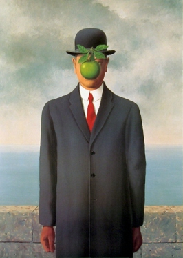
At the park we noticed a large tree with a light glowing in the middle, this reminds me of Rene Magritte's painting of the moon on the tree and how he mixes day with night. The light represents day whereas the tree is dark, surrounded, and represents the night.
(click on image) Here is an image I edited in the style of Rene Magritte. 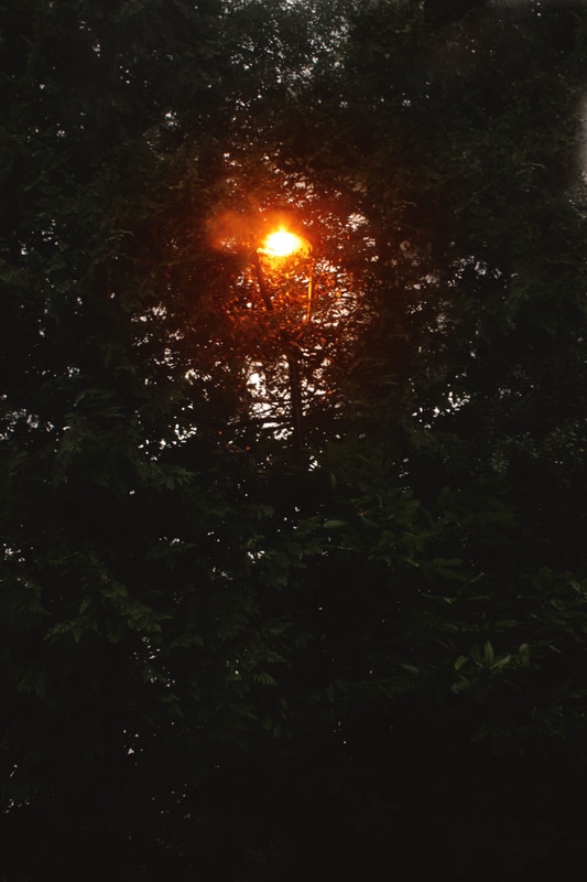
|


Salvador Dali
|
In this image I can see a clock which looks like it is melting and flaking away into the air. The painting shows a lot of textures. The object seems to be curving/falling off a table or an edge, this then fades into a beach in the bottom right corner. I think Salvador Dali is trying to portray the physical being of time, how you cannot hold it in your hand because it is always passing by. Dali has shown this by the clock breaking, twisting and melting into the air. Here Salvador has managed to metaphorically capture time in a painting. I believe this painting is so popular because it's something nobody has seen before. I could use inspiration from the variety of textures Dali has used on the clock and the idea of 'melting' in my photography.
|
MYTHICAL/FAIRYTAIL
Christopher Mckenney
This is Christoper Mckenneys work, I like his work because it is quite dark and strange but at the same time, odd and bland. It appears that his work has some kind of mysterious story behind it, I think to different people, the story will be different, and that is what is so creative about it. I also love how the images vary but all link in some way, you can tell the pictures are taken by the same photographer. Each image is very dark but beautiful and that's why they are so appealing.


|
Christopher has positioned his model directly in the middle of the image looking straight, the model's face is hidden by her dark hair, leaving no appearance on her face, this gives a distant and faceless feel to the image. We can clearly see Mckenney used a deep depth of field to focus the model and the leaves. I like this image because I love how she is surrounded by overgrown, faded and dull plants which seem to be continuous behind her. This creates a scary and lonely feel to the picture. I believe Mckenney shot this image with a low exposure, to ensure the tips of the leaves are not lost by the lighting in the sky. I like the dark edges of the hands of the model and leaves, it reminds me of a horror movie and definitely enhances the chilling theme
|
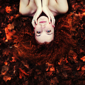
Sarah Ann Loreth
I like Sarah Ann Loreth's photography because it shows a range of dark, strange photographs to bright, beautiful images. Her work is all very wonderful and fairy-like. I have chosen this photographer because this is the style I wish to go for. Her images are all very bright and creative and unique.


|
Out of the images I have chosen, this one appeals to me the most because the colours are so pretty and I love the way her hair blends with the ground. Sarah Ann Loreth has framed the image perfectly, with the model filling half of the shot. Positioning the model upside down creates a fun atmosphere to the image. this photo has a festive feel to it because of the bright colours and autumn leaves. Her skin compliments the vibrant orange tone of her hair and the leaves. Her pale complexion enhances her features and I like how the orange tones range in the leaves
|
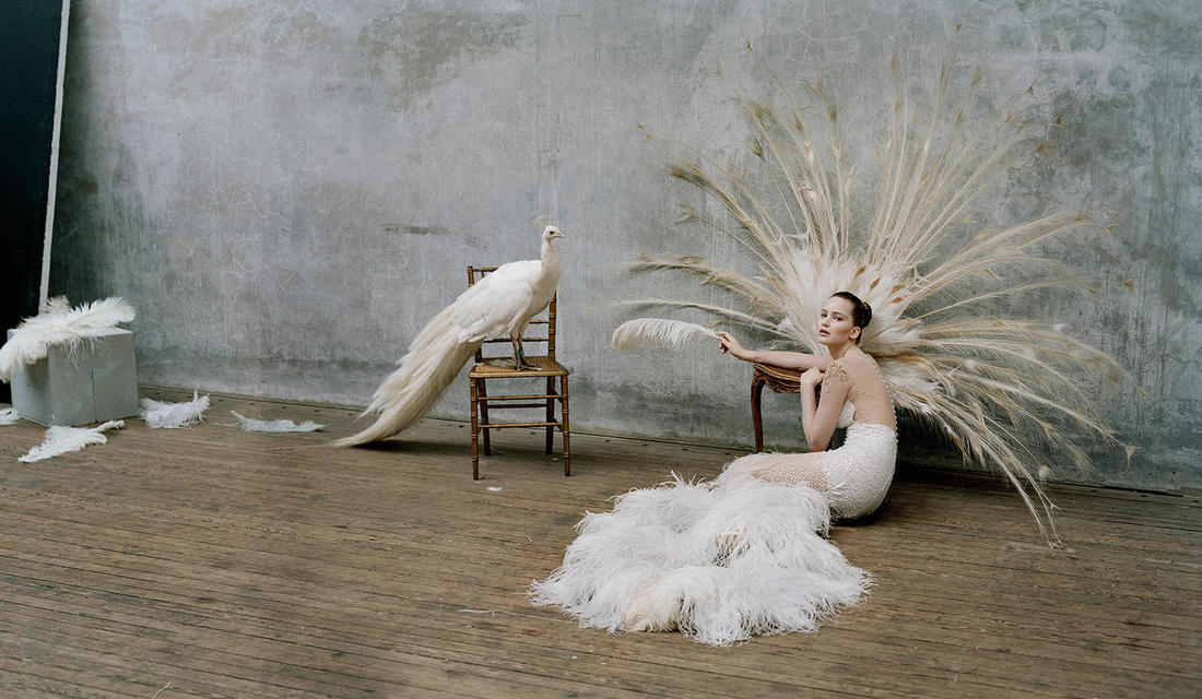
Tim Walker
I like Tim Walkers work because it is very bright, beautiful and delicate. His models are all very flamboyant and eccentric. I love these images because they are very simple but full of soft, angelic colours, each image has its own story and contrasts in colour codes. I love how he has re told classic old stories in an image like Edward Scissorhands and Hansel and Gretel.


|
This is my favourite image from the pictures I have uploaded because I love how soft and beautiful the colours are and how the textures used (feathers, cloth, wood) are all very alike and delicate. The colours and textures and bird give the image a soft appearance. The shoot seems to be very thought out and planned. Tim walker used the rule of thirds to position the model on the right side of the image. The shot was taken in a studio with what looks like quite soft lighting, maintaining the natural colours from the flooring, costumes and backdrop
|
Agnieszka Lorek
|
|
Agnieszka Lorek is a Polish photographer who is best known for her fairy-tale portraits. I love Lorek's work because the colours are very vibrant and her images look like paintings, she presents her models as very soft and beautiful she shoots in very natural areas and her images are very bright and mystical. I love how her models echo the setting, for example when the background is darker and harsh, the model wears darker clothes and her posture is eerie and on edge whereas if the model is surrounded by flowers and light colours, the model wears neutral/pretty colours and usually close their eyes or gaze.
|


IDEAS
Red Riding Hood Fairytale Theme
I have always loved the theme and story of Little Red Riding hood, I believe the 'Weird And Wonderful' topic is perfect for it because the story can be changed into something scary and lonely, or into something sweet and beautiful. The images I have chosen are all very different and unique, but I am going to take inspiration on the positioning and styles.


Angels.


First Shoot.- Angel.
This is my first shoot in the Weird And Wonderful topic. Between 'weird' and 'wonderful', i am definitely leaning more towards 'wonderful'. Here I have photographed an Angel. For the makeup, I used silver glitter on my models eyebrows and under eyes and cheeks. This is because angels are usually presented as beautiful, shining, stunning creatures. I have changes the movie settings on my camera to black and white for some of them to achieve a simple, clean look. The first shoot is taken in front of a white wall to show brightness and simplicity. It was definitely difficult to produce sharp images as my shutter speed was low due to lack of lighting, to overcome this issue I increased my ISO and continued shooting. But I believe some images look appealing with the 'blurred' affect. My model demonstrated a variety of stances to see what works best with the colours and wings, I have taken some with the angel reaching her hand out, this is because I am later going to photoshop a flame onto her hand as if she is holding it as fairies/angels are magical. When taking these images I have also used rule of thirds when postitioning my model and experimented with close ups/mid-shots and portraits/landscapes.


Worst

|
From the shoot, this is my worst image because my model was not ready and the picture was over exposed and therefore outfocused and blurred . There are some aspects I like about this image, I think the over exposure looked quite angelic and heaven like.
|
Favourites


The images I have chosen are pictures I would like to improve by photoshop. I like all of these pictures because the wings are shown very clearly and the postures are very bold.
reshoot (2)
I decided to re-shoot my angel because the lighting was quite dull before and hard to take images so the results were quite blurry and dark. This shoot has better quality than the last because I have used lighting which allowed me to use a higher shutter speed and the images overall seems more angelic.


First edit from second shoot
After the second shoot I failed to think about the next steps to develop my images into a final piece I am happy with. Instead I decided to move on and re-shoot completely but I didn't want to waste the previous images I took so I decided to play around with them and ended up with two edits. They fit in with my angelic theme.


Levitation Fairy
I would like to end my fairy/angel topic on something graceful like levitation. Here are some images I am using for inspiration, I like the stances and colours in these images. I will take these in for consideration when shooting.


Final Fairy Shoot.
1st


1st- Final Edit
To achieve this edit I removed the stool from beneath my model and added a shadow on the grass to make it look like she is really levitating, I then added multiple filters and adjusted contrast, exposure and brightness. After that I added noise onto the image because i like the effect it has on the picture. Finally I added a lens flare and adjusted the brightness of it so it appears realistic.
Overall I am happy with the outcome of this picture. I like the fairy-like editing and the composition. I believe my model does present a fairy form in this shoot.
Overall I am happy with the outcome of this picture. I like the fairy-like editing and the composition. I believe my model does present a fairy form in this shoot.

2nd


2nd- Final Edit
I love how this second edit came out. I love the dark, Gothic feel in this image. The angel looks very pretty with her being so bright and white, surrounded by dark faded leaves. To achieve this I adjusted the exposure and brightness, again in this image I have removed the stool so my fairy is levitating. The veil material I have used has a nice effect on the fairy like she is precious and royal.

3rd


3rd- Final Edit
This is the first image I edited. I chose this picture because you can clearly see that the model is levitating. I love the blue/purple glow on the fairy and how it illuminates in the dark background. I believe this is a good real life portrayal of a fairy. The setting I shot in fit perfectly in with the subject because fairies are mostly known to be living in trees and natural areas. I am glad the model was holding the green bulb in this shoot because I believe it makes the image a lot prettier and enchanted and magical. On photo shop I added a smaller light/glow inside the bulb as if she is holding something fanciful.

4th


4th- Final Edit
In this shoot I like the way I used the veil, I told my model to hold up one side and then I held up the other side over the camera, I didn't really know what to do with the images so on photo shop I darkened the image, added some vignette to darken the corners and added smaller paint dots to add some slight colour to add more to the theme.


5th


5th Final Edit
When shooting, I used the rule of thirds to position my model directly in the middle of the image. I thought it was appealing how the fairy was dressed in white and stood directly in the middle of dark trees, I like how the colours compliment each other. In photo shop I managed to brighten the fairy and I added an orange tone to make the image seem warmer. I thought it would be a good idea to add butterflies, I found some bright, white clip arts on google and added them to the picture. I believe the butterflies make the image very beautiful and fairy-like. I also added a large glow over the green bulb because it is directly in the middle of the image and is what first grabs your attention. This then created a lens flare from the light. On photo shop I also brightened the top left corner so it seemed the light from behind the trees were illuminating the image.


6th


6th Final Edit
I have used a slight vignette in this image to create a more dim and mysterious feel to the picture. The shadowing in the picture gives a goth-like feel. The light tones coming from the top of the picture make the sky look brighter and the gradient effect of that light turning dark as it gets closer to the ground is very appealing. In photo shop I also added a shadow beneath her to make her look like she is drifting, I love the positioning of my model in this image. I like how her long skirt and veil she is holding is drifting above the floor as if the wind is holding her up. Overall I think this is my favourite edit from the shoot, I admire the colours, location and composition.

7th


7th Final Edit
This is my last edit from my last shoot. I placed my model on a tree and kneeled down to get the tall trees into shot. I like how the trees tower over and how the model is looking down at the camera. I wanted to try something creepier than my other photos, I decided to add eyes to each of the trees, resembling an additional surrealism theme, I thought it looked pretty and eerie. I brightened the image a little on the second image which seemed to whiten the model's wings and outfit. I added grain because I love the grain effect. I also removed the face of the fairy. Removing the fairies face created an strange and nameless impression to the image. Overall I like these pictures because both edited images have a strong ambiance.


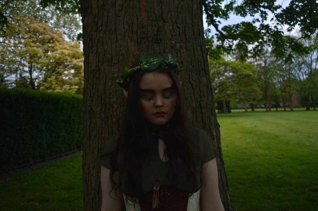
ELVES
For my next project in weird and wonderful, 'Mythical/supernatural', I would like to do Elves. I want to do elves because it fits in with the theme and my past fairy project. To achieve this I need to get a model, gather the outfit and makeup then decide where I want to shoot. When photographing the elf I would like to experiment with some green fairy lights because I like the effect it has. Below are some images I am taking inspiration from.


Editing apps you can use on mobiles
|
|
Aviary- This app is good for editing your images on an iphone or ipad. I like the range of filters it provides. It is very easy to use and free.
|

|
snapseed- This is photo editor it is good for image enhancements and corrections
|
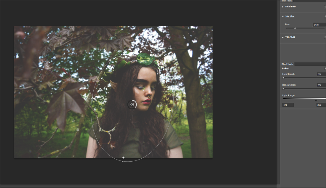
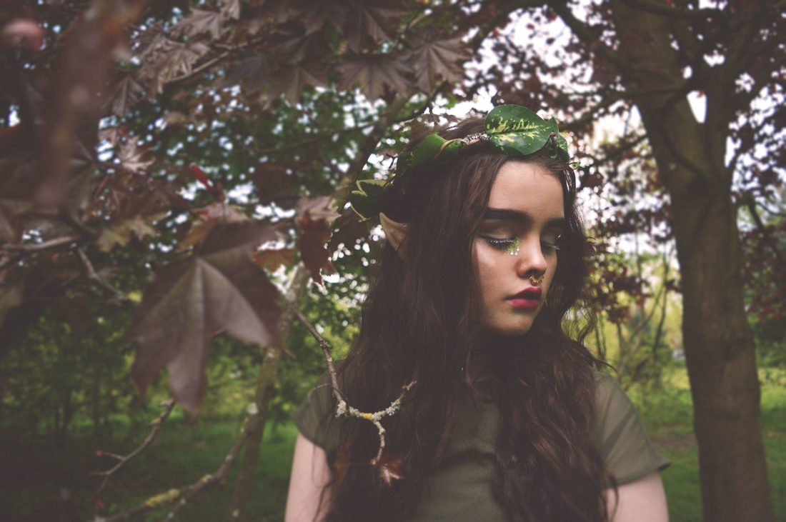
Shoot 1


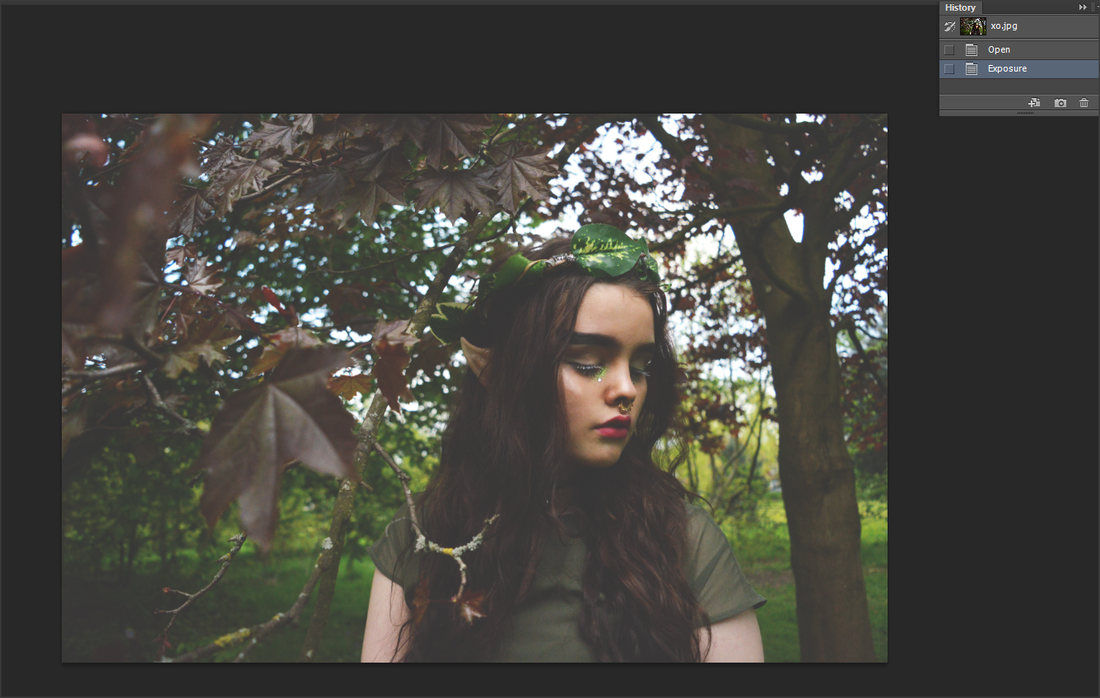
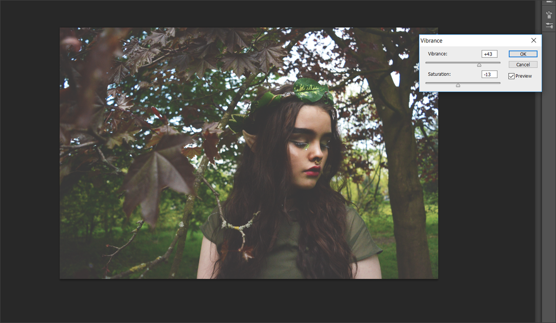
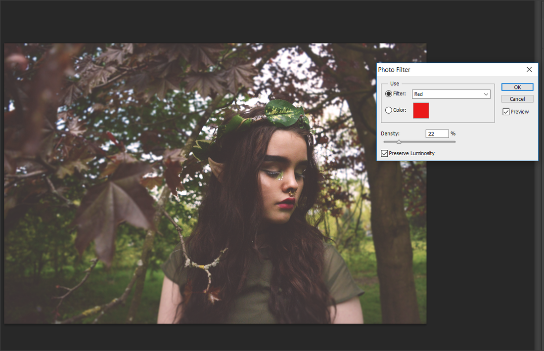
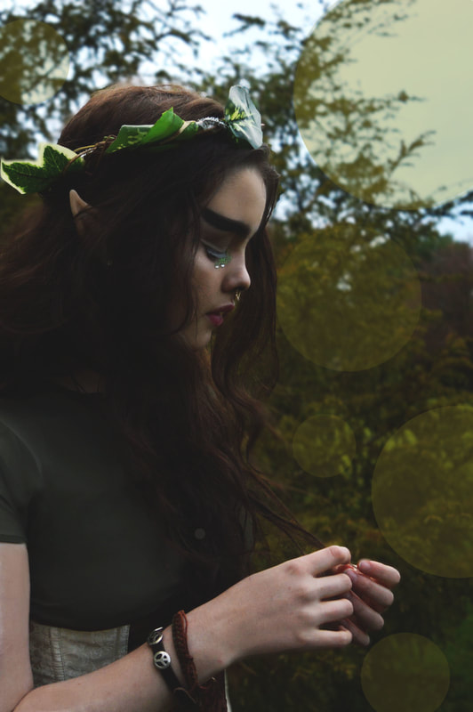
This is my first edit from my first elf shoot. When editing I out focused the background by using tilt shift and removed the shadows on her face. I also heightened the vibrancy to add more green on the crown and leaves in the back, this also created a paler tone on her face. When shooting I used the rule of thirds to position my model in the middle of the image, this adds a simple touch to the picture. I am happy with my model's pose, how she is looking over her shoulder. I believe it creates a mysterious impression. in this position I can see the ears, crown and makeup very clearly.
Overall I am happy with the result of my first shoot because it is very pretty to the eye and does reflect my artist research and previous images I found of elves online however it does contain a personal atmosphere from my model, makeup and props.
Overall I am happy with the result of my first shoot because it is very pretty to the eye and does reflect my artist research and previous images I found of elves online however it does contain a personal atmosphere from my model, makeup and props.
Shoot 2


This is my edit from shoot two. In photoshop I decided to create a warmer look by adding orange tones, I chose this picture as I liked the composition and the model because I can clearly see the ears, her hair looks very wavy and graceful in the sun. I liked how the sun shone through the trees in the original image so I decided to add a lens flare at the top left to exaggerate the glow, which also added a pretty light orb at the bottom right. I like the images from this shoot because the tree really completes the elf theme.
Overall I believe this image looks very calm, innocent and beautiful.
Overall I believe this image looks very calm, innocent and beautiful.
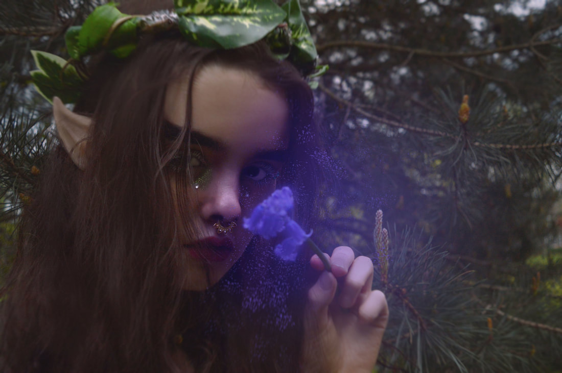
Shoot 3


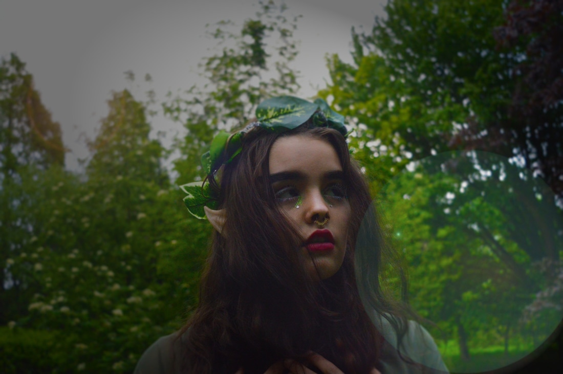
This is my final edit for shoot 3. When editing I have Screenshotted a few settings I used to get this result. I wanted to bring out more of the green in the image so I increased the vibrance and brightness/contrast. After that I adjusted the exposure and blurred the background, I then added a lens flare to create the glow in the top left corner and a large orb in the bottom right corner. Overall I believe this edit is quite pretty and mythical. I love how all the colours pop in the image. I chose this image because I liked how lost the elf looks and how it portrays a mythical vibe.
Shoot 4


|
|
|
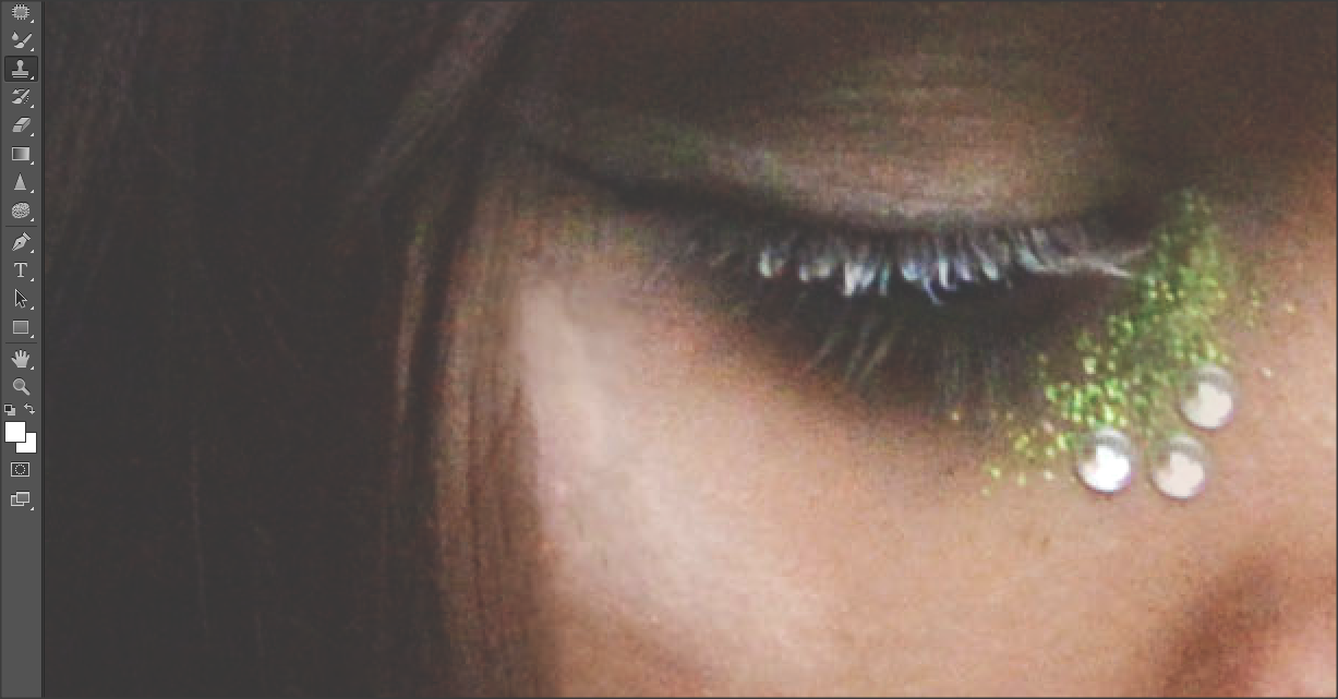
This is my final edit for shoot 4. In photoshop I have screenshotted a few ways I have edited. In this process I have adjusted the exposure, brightness/contrast, filter, tilt shift to out focus the trees and I have used the clone tool to increase the glitter beneath her eyes and to add two more gems at the corner of her eye. I have also exaggerated the brightness to amplify the colours and her highlight on her cheek. Overall I love the pastel/faded effect and how the leaves and branches are out-focused.
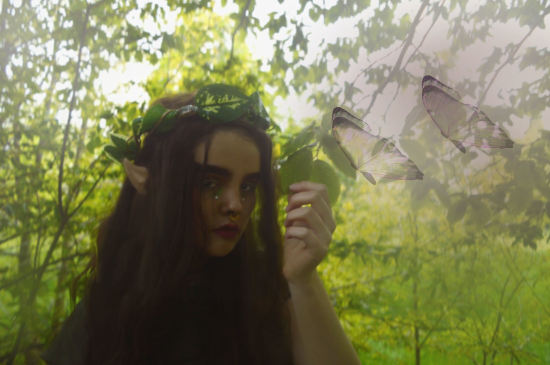
Shoot 5


This is my final edit from my fifth shoot in photoshop. I believe this is my favourite edit I have done so far from weird and wonderful. I wanted to try something more mythical and enchanted. I realized a lot of my edits looked the same and wanted to add a more fictitious background. I have used inspiration from my artist research, Agnieszka Lorek, I liked her work because they looked like paintings and I loved it because it seemed very fairy-tale like and unreal. The photoshop process took a very long time so I decided not to screenshot the method, to reach this edit I cropped my model and placed her on a beautiful green forest background I found on google images. I then edited her(exposure, curves contrast etc), used the clone tool to increase the glitter and add two more gems beneath her eye, smudged her hair, used the paint tool on her face/arms, whitened her eyes and added highlight in her hair and at the edge of her face for the glow from the butterfly. I also used the 'soft light' paint tool and a low opacity to add the mist light glow near her face and in her hands. I then added and edited the butterflies to make them almost transparent, I believe they fit perfectly with the glow and I love how it illuminates the trees and her face and I also whitened her right eye to seem more illuminated from the glow. I finally blurred the image to create a painting effect. Overall this image took me a long time to edit and I am very proud and pleased with the outcome. It fits in perfectly to my theme and I will use the skills and techniques in future images.
Shoot 6


This is my final edit from my 6th shoot. To get this result I amplified the greenery in the back and lightened the image as the original picture was quite dark. I thought it was quite hard to edit because the photo was not the best quality as I used a high ISO when shooting. This made the image very grainy and this almost blended my models dark hair with her dark dress. When editing I decided to paint over some of her face to lighten it more and her hands and ears. I also painted over her facial features and crown. I then used the smudge tool on her hair and brightened her eyes and gems beneath her eyes. I decided to keep the background and added some more light at the top of the image to give the illusion more light is coming through. I also used a green colour on the paintbrush tool and decreased the opacity to make the image more misty which I like because it looks more mythical and enchanted. Overall I like the edit, I used skills that I learned in my previous shoot too like the paint tool and I decided to add the same butterflies because they fit in with the elf theme
Shoot 7


Shoot 8


Shoot 9


Evaluation
In this Weird and Wonderful project I chose the theme Mythical/Fairytale. At the beginning I researched photographers, such as, Christopher McKenney, Sarah Ann Loreth, Tim Walker and Agnieszka Lorek. I believe, looking back on the artists, I have definitely used their images in different ways as inspiration, whether it is using similar backgrounds or makeup or even exposure and composition. I had determined these artists because they all have a similar theme and are all pretty in their unique way, I liked the bright, beautiful and alluring photoshop. I loved how you could distinguish each photographers work and how they all preserve their own style when editing. This is what I wanted to portray in my work.
In the Weird and Wonderful topic I decided to expand on 'Mythical/Fairytale' because I love the idea of making something which cannot be existent in real life, come to being. This topic was also something with a large 'range'. Enabling this topic eliminates the limit on my ideas, as all of my ideas at the time (unsuccessful too), fit into the genre of fairytale/Mythical.
In the Weird and Wonderful topic I decided to expand on 'Mythical/Fairytale' because I love the idea of making something which cannot be existent in real life, come to being. This topic was also something with a large 'range'. Enabling this topic eliminates the limit on my ideas, as all of my ideas at the time (unsuccessful too), fit into the genre of fairytale/Mythical.
