Campaign Zero: Practice Analysis

The title of this photo is 'Campaign Zero: To end police violence in America'. The photographer has used a shallow depth of field by focusing only on the man positioned on a power spot in the middle of the picture. I like how the background in the picture is so busy, yet un-distracting as it is so unfocused, Because the background is so full and busy, I think the image would have a rough bumpy texture to it. Overall, the image has a blue tone over it, this makes the image feel cold. As you look further to the back, the shape in the image changes to blurry circles, this draws more of your attention to the front of the photo. The campaign is about stopping violence in America towards black people. The camera angle is positioned just above, looking down at the man closest to the camera, this represents him as a victim who needs help.
Examples of campaign photography.


|
This campaign is very popular and important. It is a campaign against smoking. I think this image is powerful. I like this piece of photography because it is very creative, the photographer/creator has included a lot of thought into it. I love the darkness in the image and the model's facial expression to make the image look angry and frightening; this is a perfect emotion for the campaign because the photographer/creator is trying to get his/her point across to the public as the topic is already so popular and so many people are choosing to ignore it. The prop they have used in this image is very important and powerful, it is a cigarette gun. the gun to represent death and the cigarette to show the topic. It is powerful because he is holding the gun to his head to show that he is killing himself when smoking which is correct. This poster is disturbing but powerful and clever.
|

|
This campaign is about abusive parents. It is explaining how anger breeds anger. The first thing you notice is the mother screaming at her young daughter, you then notice an older daughter (you can tell that it is an older version of the little girl because they are wearing identical clothes) getting angrier. The older she is getting, the more anger is being built and stored inside of her until eventually, she becomes an abusive parent. This picture is very well thought-out and powerful and creative. I like this picture because it holds a strong message. This photo makes you have to look twice, before the message clicks in your head. I like these kind of pictures because you are able to understand the whole scenario without reading any words, these kind of campaigns are very clever and stand out to me.
|
CYBERBULLYING
For my campaign photography, I have decided to choose the subject of cyber-bullying. Cyber-Bullying is the action of bullying online.


|
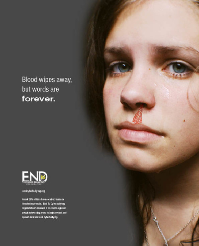
This is a campaign against bullying/cyberbullying. It is explaining that words hurt more than you think and it is comparing the situation to physically being bullied. The message says 'Blood wipes away, but words are forever.' here they are explaining that if you are physically hurt, it can be fixed but words can be stuck in your head a lot longer. The girls face makes the poster alot more powerful, she is looking into the lens directly at the reader to make it more personal and she has words dripping from her nose in a red font (representing the blood). The photographer has took this picture in a studio and has used photoshop to place the girls face to a smaller part of the picture but has made her stand out because the background is dull. I like the grey colour in the background because it is a serious topic and would be more suitable to put a darker, blander colour in the background rather than a lighter, fun colour. I also like how they have made the word 'forever' bold. This is the most powerful word in the sentence and they have made it stand out so the reader notices.
|

|
I like this picture showing cyber bullying, because they have expressed how cyber bullys are hidden behind a computer screen so they are not afraid to say anything, they are not afraid to hurt you. Its like they have a mask because you can't see their face or know who they are. For my campaign I would like to involve the mask because it has a lot of meaning and shows clearly who the predator and who the victim is
|

|
I like this picture idea because I like the way the text messages are scattered around her and how she is placed in the middle clearly showing she is the victim.
|
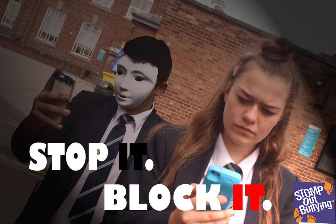
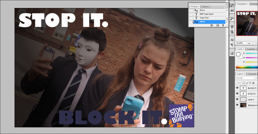
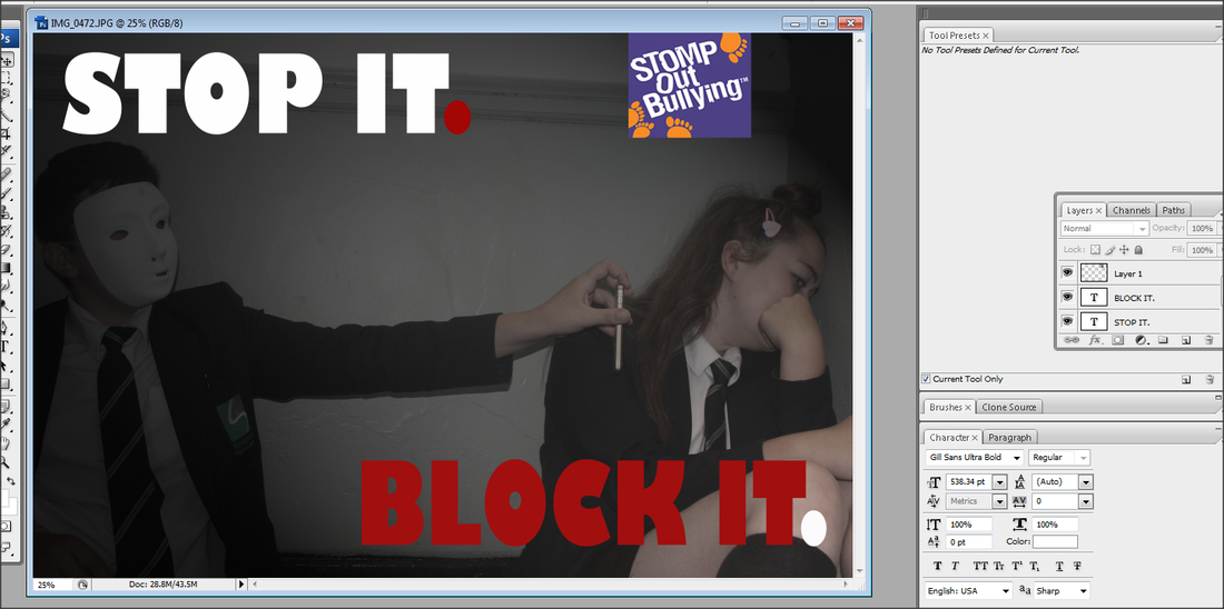
STOP IT. BLOCK IT.
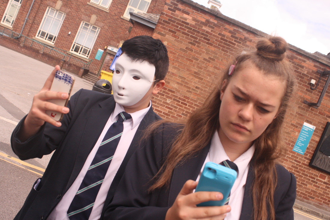
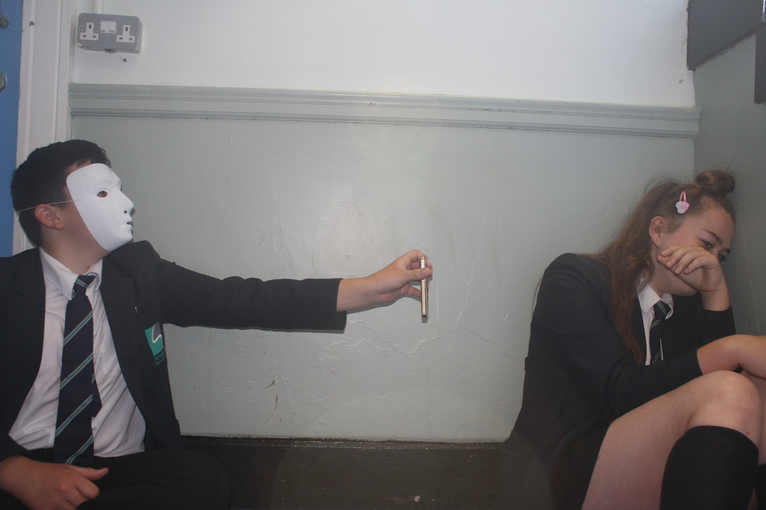
Shoot 1


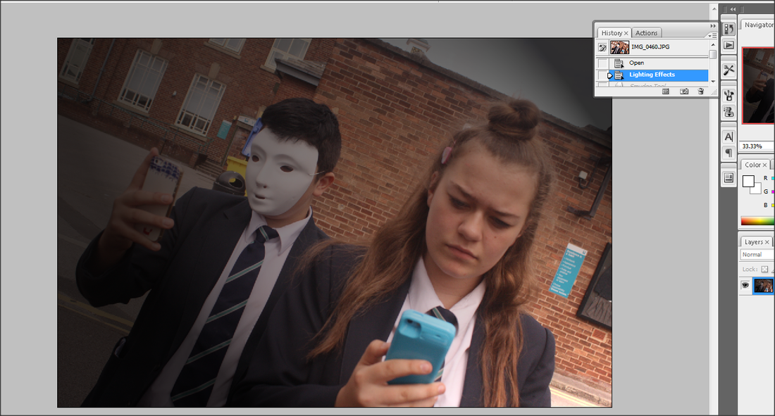
In this shoot, the cyberbully is wearing the white mask to represent that he is behind a computer screen and you don't know his face. He is positioned behind the victim, making the victim the subject of the image. She is looking at her phone as if she received a message from her cyberbully. This photo shows that cyberbully's can be anywhere you are and are always behind you and as near as your phone, like a stalker.
Worst

|
This is my worst picture from the shoot simply because my actress, Kayla is pouting. Other than that I like the angle and the way the actors are set out and positioned.
|
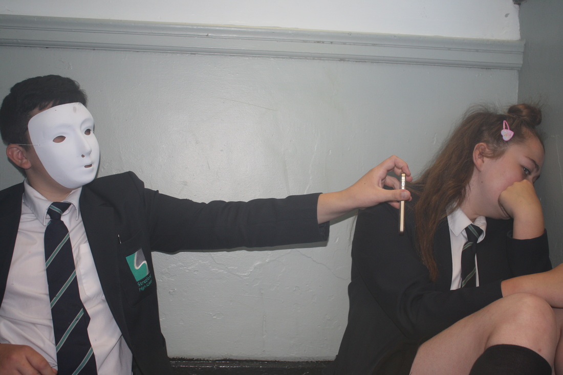
Best
|
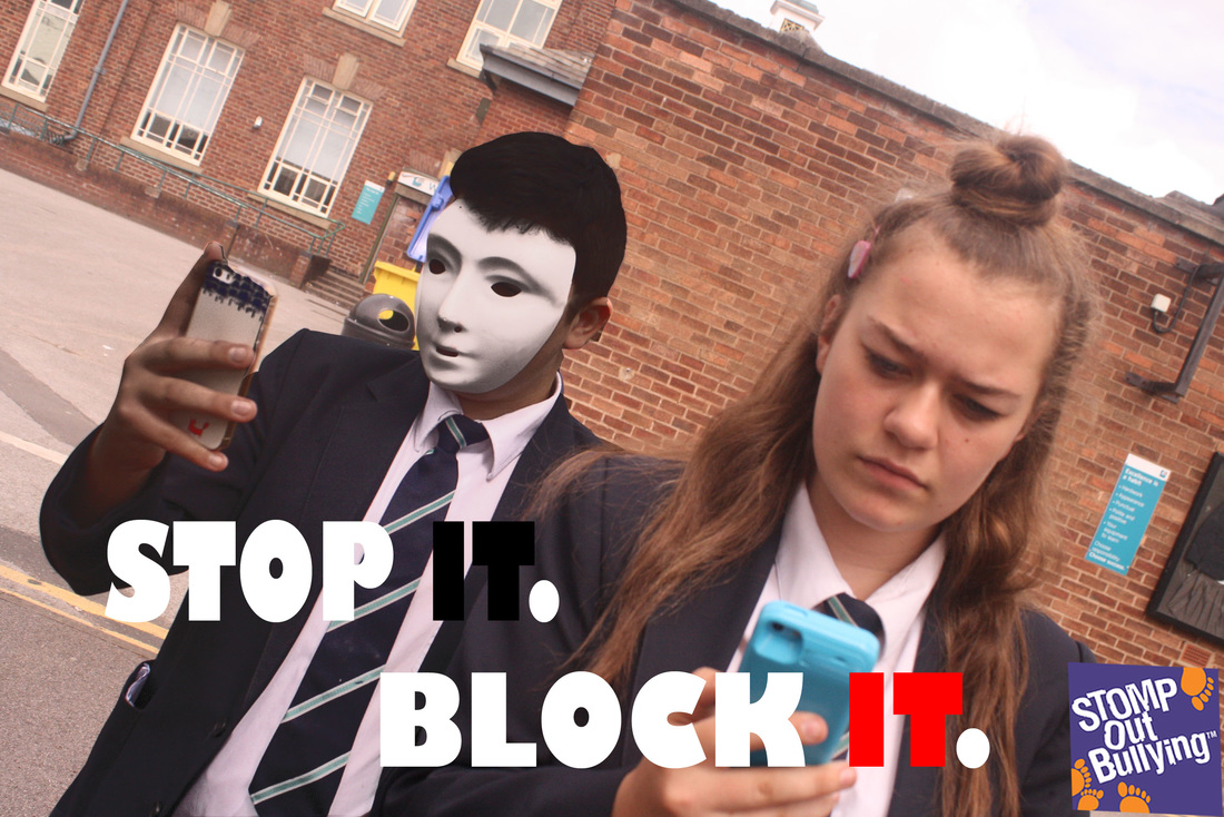
This is my best picture from the shoot. I like the emotion on the victims face and how the angle is slightly tilted as this allows the cyberbully's full arm holding his phone into the image. I like the positioning of the characters and how the background is quite plain so there is nothing that draws your attention there.
|
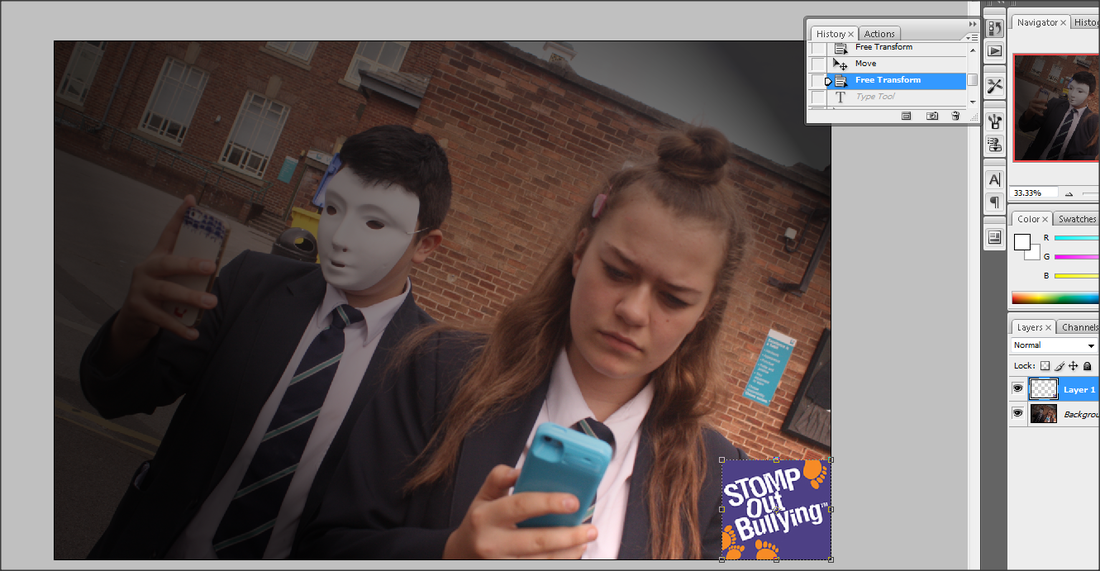
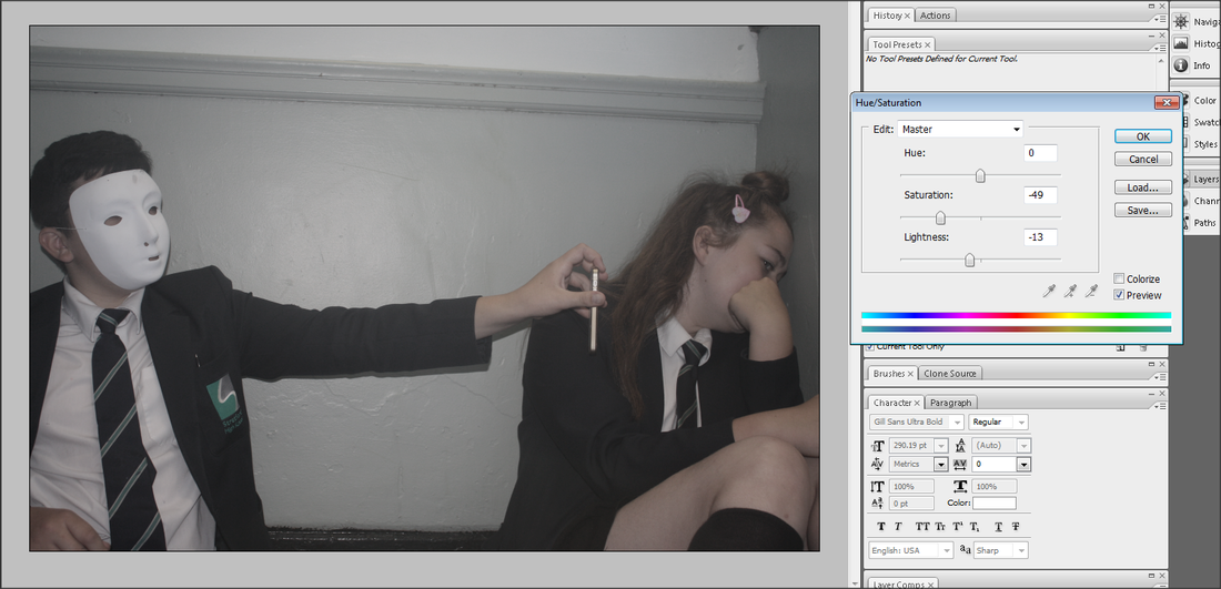
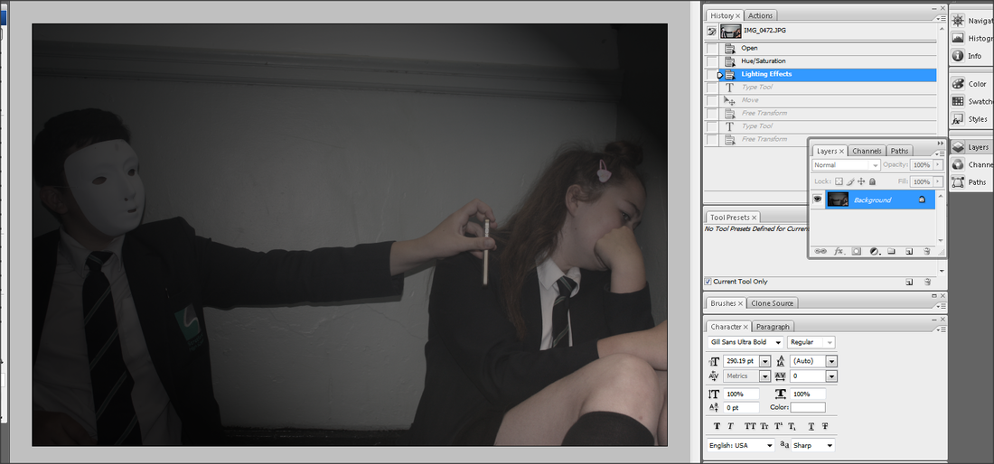
Photoshop edit
|
|

|
|
Shoot 2


Worst

|
This is my worst picture because the flash was too bright and allowed the sun to effect the image. I also do not like the positioning of the models in this photo, the spacing is too wide between them and, looking at this picture, you could not tell it was about cyber bullying.
|
Best
|
This is my best photo of this shoot because I think it shows the message a lot clearer than the others. I like how Kayla is leaning against the wall and leaning away from the bully. I don't like how the beam on the wall is slant in the picture.
|
Photoshop Process
|
|
|
|
Photoshop Edit


Photoshop Edit
|
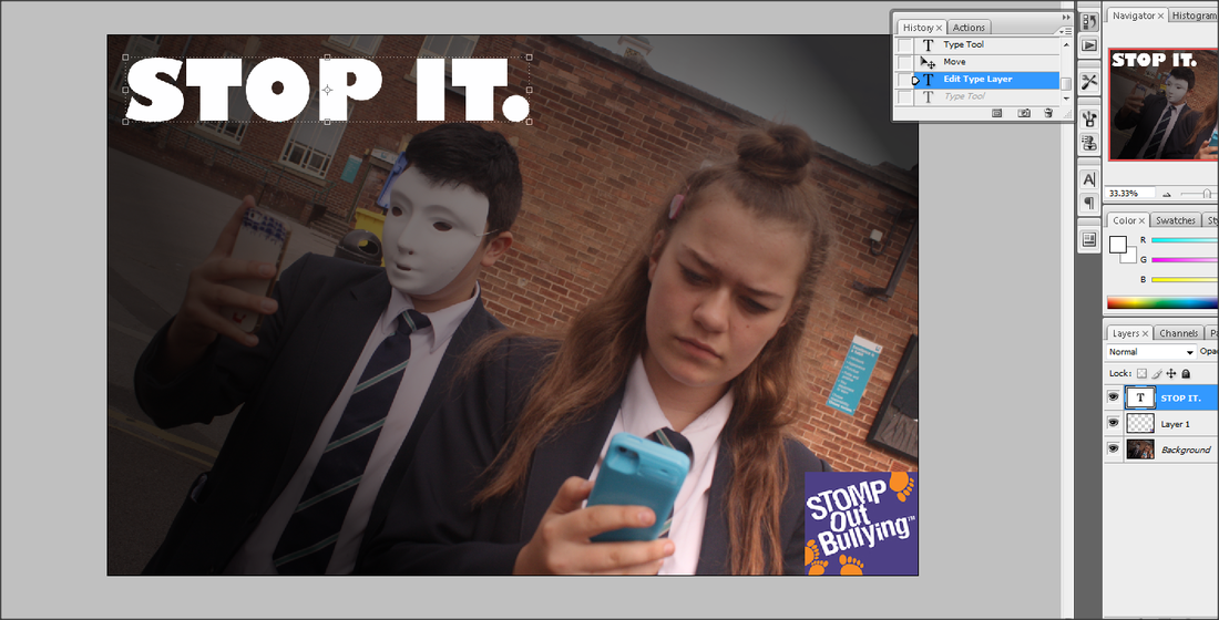
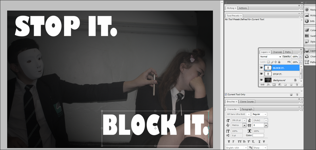
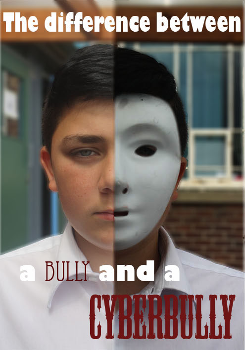
This is my final piece. I edited this image over different lessons so I am not able to screenshot the method I used. Firstly, I cropped each photo in half and linked them together so they match, I then selected the 'cyberbully' side (the side wearing the mask) and used the 'hue/saturation' to darken the setting. I then matched up the faces so they are symmetrical and the face shape matches. Next I selected the background and used the 'blur' tool to out focus everything but my model. After that I Blurred and smudged the line between his face so it looked like the pictures definitely matched up and removed any imperfections. This made the image look tidier. Then I added the font and coloured some words to make them stand out. I am happy with how the image came out. In this image, the message I am trying to get across is you are still the word 'bully' , whether you are online or not, and really a cyberbully is a lot worse than a real life bully, because you are hiding behind the mask (which is a wearable representation of being behind a computer screen). If you target someone or say something mean online, you are still marked as a bully. If I were to re-edit this image, I would try to match the hair and make it look more similar texture to the image on the left.
|
Cyber bullying Keyboard


Worst

|
This is my worst picture from the shoot. I do not like this picture because I clearly took it at the wrong time. My actor was preparing for the shoot, adding more paint onto his hands. This image will not be used.
|
Best

|
This is my best image from the shoot. I was not completly satisfied with my overall pictures because i believe none of them clearly portrayed my final cyberbullying message. If I was to go back to this topic I would re-take this shoot and position my camera correctly to include all details for the audience. This is my favourite image from the day because I like how I used depth of field to unfocus further along the keyboard, and I darkened the exposure to create a more serious edge to the picture. In the image you can clearly see the blood from his fingers being spread among the board and this is one of the large details I wanted to show. I also like how callums fingers are slightly blurred to show the fast motion from his hands.
|
Artist Research: Pussy Riot
Pussy Riot is a Russian feminism protest punk rock group based in Moscow. Founded in August 2011, it had a membership of approximately 11 women ranging in age from about 20 to 33. The group staged unauthorized provocative performances in public places, performances that were filmed as music videos and posted on the Internet. The lyrical themes included feminism, LGBT rights, and opposition to Russian President Vladimir Putin,


My Work: Manchester International Festival
Here I went to a workshop after school, where some members of the Manchester International Festival visited school to a group of girls and made a feminist speech to stand up to women rights and represent women and girls in society. When they had made the speech, members of the festival brought in balaclavas for the girls to wear and printed off coloured sheets of the speech. I took photos of the girls in front of a bright blue wall as the Pussy Riot band was known for bright colours and in the art classroom when they read it.


Evaluation
My Project task is about Cyber bullying. Throughout the task I have used many different techniques including depth of field, exposure and rule of thirds, I have also demonstrated different skills on photo shop when changing the hue/saturation, text, selection tools and smudging/blurring and cropping. I am happy with the techniques and materials and props I have used in the shoot, If I were to go back and change something about the images, I would re-shoot my second shoot of the campaign because I didn't like the positioning in the image and the setting I was taking the photos in, they didn't come out in the best of quality. Also I would re-take my last shoot of the blood on the keyboard, I didn't have any fake blood so as an alternative, I used red paint but I don't think it came out as realistic as I thought, and I would've darkened the exposure and experiment on more pictures because it didn't come out to a professional level. I have used ideas from campaign photos of cyber bullying at the top of the page. I have used the mask idea from one of the photos because I thought it was a clever representation of a cyberbully, and I also darkened some of my images from my shoot, also inspired from other cyber bulling images from the internet. In my photos, I have portrayed bold, strong messages to my audience, as cyber bullying is an important campaign, I have tried to make the pictures very serious to follow the message. To improve to the next grade I think I need to include more analysis on my work and explain my opinions on the shoot, I also need o take in for consideration the different compositions when shooting. Overall I think my project was successful, because I have included different props and produced 4 different shoots in distinct and individual settings which all put across a clear message of the topic of cyber bullying.
